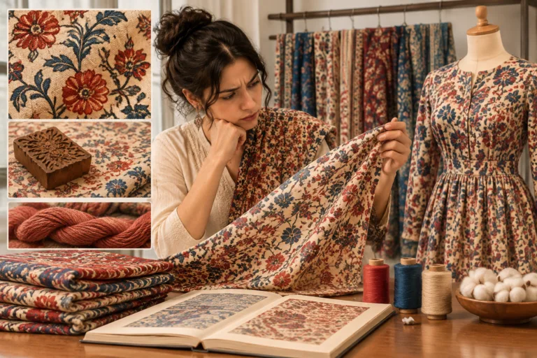

Choosing apparel brand color palettes means making assumptions about how color will appear on fabric, under different lights, and to the people the brand serves. A palette may look consistent in a digital guide but change across materials or viewing conditions. This guide explains how to identify those assumptions, understand the variables behind them, and begin testing customer response. See Sponsor for information about Apparel Wiki’s sponsorship policy.
A palette assumption is an untested expectation about how a color will reproduce or what it will communicate. Writing these expectations down helps founders, designers, and product teams decide what to check before they commit to a color direction.
The Assumptions Hiding Inside a Brand Color Palette
A brand color palette is a set of choices that helps express a brand to a defined audience in particular settings. Color works alongside elements such as a logo and typography; it is not a standalone aesthetic decision. Each swatch can carry expectations: that it will look consistent across fabrics, that a screen or print reference will resemble the garment, and that the customer will see it in lighting similar to the team’s evaluation conditions.
These assumptions fall into two broad groups. Technical assumptions concern color reproduction: whether a screen reference can guide a fabric color, whether the same color will look alike across materials, and whether lighting changes what viewers see. Audience assumptions concern recognition, appeal, and association: whether customers notice the color, like it, or connect it with the intended use or brand identity.
Neither group is settled by a palette’s visual unity. A set of swatches can look harmonious in a brand book yet appear different on ribbed knit and woven twill. And a cohesive palette does not, by itself, demonstrate product advantage. Its value depends on the audience and scenario it is meant to serve.
Start by listing each core color and writing down what you expect about its fabric appearance, viewing conditions, and customer response. Keep two questions separate: how would you check the assumption, and what result would you accept? A check is a method; the acceptance requirement is a project decision. This list gives later comparisons and customer research a specific purpose.
Why the Same Color Reads Differently Across Fabrics, Screens, and Lighting
Color reproduction changes with the surface and medium. Fabric texture affects how light reflects from the material, while fiber and construction influence how a dyed color appears. A screen creates color within the capabilities and settings of its display. Ambient light also matters: two colors that appear similar in one setting may look less alike in another. Treat these as variables to control and anticipate, not as proof that a particular color will fail.
A single digital value cannot specify a dyed result. A hex value describes a color for screen use; translating that reference to fabric involves material-specific choices. The same target color may require different dye recipes on different fibers or constructions, and the resulting appearance may still vary. One palette value therefore does not guarantee one visual result across a product line.
Brands can establish reference conditions, keep physical samples as comparison points, and document the lighting used to evaluate them. They cannot control every setting in which customers will see the product. Retail lights, home lighting, and individual device screens vary, so a team can reduce uncertainty without eliminating it.
Any claim that colors “match” needs context. Record which fabric and reference were compared, the viewing conditions, and the evaluation basis. Sampling and evaluation conditions affect comparability, so results from different conditions should not be treated as directly equivalent. Consistency can support recognition, but it is not evidence of product quality or advantage.
Apparel Brand Color Palettes Customer Research: What You Are Actually Testing
Useful apparel brand color palettes customer research begins with a question tied to an assumption. For example: Can people recognize the core color among competing products on a rail? Does it read as intended across the garment styles and skin tones relevant to the line? Does it fit the use context the brand wants to communicate? The question should name an observable response, rather than presume what a color means.
Early-stage teams can compare physical swatches or garment mockups side by side in a realistic setting. They can also show palette-only cues and ask participants to recognize or recall them, conduct short interviews about the meanings and contexts people associate with the colors, or use a simple preference sort to see which colors participants connect with the brand. These approaches answer different questions; none alone establishes how the palette will perform in every market or setting.
Separate preference from performance. Preference research asks which colors people like. Performance research asks whether a color does the job intended, such as supporting recognition or fitting a stated use context. A liked color may still be hard to distinguish from competitors or unsuitable for the experience the brand promises.
Keep prompts neutral: asking “What does this color suggest to you?” is less leading than naming the association you hope to hear. Avoid relying on one viewing context when customers encounter products in varied lighting. Small or unrepresentative groups can offer useful early direction, but their responses should not be generalized to all customers.
Finally, connect claimed associations to the product experience. If a palette is meant to signal a particular use, consider where and how the garment must deliver on that expectation. Customer responses can inform a decision; they do not establish universal color meanings or guarantee market results.
Comparing Color Across Screen, Print, and Physical Samples
Color comparison is useful only when the reference and viewing conditions are clear. A screen review can help a team discuss direction, while a physical sample can show how a color behaves on a particular fabric. Neither result should be treated as more general than the conditions that produced it.
| Comparison situation | What it can reliably tell you | What it cannot tell you | Practical next check |
|---|---|---|---|
| Early digital-stage, screen-only palette review | Whether the palette is coherent as a digital expression system | How colors will appear after dyeing or on different devices | Review physical swatches before approving a garment color |
| Early print collateral check | Whether printed materials communicate the intended visual hierarchy | Whether print and dyed fabric will look identical | Compare the print reference with a fabric sample in the intended use context |
| First fabric sample review | How the color appears on a named fabric, construction, and surface | How it will behave on every fabric in the line | Check the dominant constructions and document the viewing conditions |
| Physical production-reference review for line continuity | Whether related samples remain acceptably consistent under the agreed comparison conditions | Whether customers will see the same result in every retail or home setting | Record the reference, sample identity, fabric, lighting, and acceptance decision |
For apparel, a physical reference sample viewed under consistent lighting is usually the anchor for color approval. Screens and prints remain valuable communication aids, but their appearance depends on display, output, and viewing conditions. A digital color value therefore helps identify intent; it does not fully specify a dyed result.
Consider a knit-heavy line built around one signature color. Checking that color on a rib texture and a heavier loopweight version before locking the palette may expose a problem early. The priority could change if the line later shifts toward a different dominant construction, so the decision should follow the actual product mix.
Record each comparison in a way another person can understand. Identify the fabric and construction, state which version was the reference, note the lighting condition, and describe whether the judgment was visual or supported by another documented method. Reports produced under different conditions should not be treated as directly comparable simply because they contain numbers.
Also define the acceptance expectation before comparing. A project may require close visual continuity, or it may allow a deliberately fabric-specific version of one color. That threshold is a project decision, not a universal rule. Keep the checking method separate from the result the brand is willing to accept.

Turning Research Findings into Palette Decisions, and Knowing the Limits
Research becomes useful when each finding leads to a recorded decision. For every tested palette assumption, choose whether to keep the color, adjust it, or split it into fabric-specific versions. Retain the reason, the context, and the evidence used. This gives future teams a decision trail instead of an unexplained color name.
A palette tuned to one research setting may become less flexible as the line expands into new fabrics, price tiers, regions, or product categories. Apply findings according to their intended scope. A result from a screen preview may guide digital communication, but it should not automatically control a physical sample decision.
For example, research may show that a secondary color reads as neutral on physical swatches but suggests a different context in social-media previews. The brand must decide which setting matters most for the job that color performs. That decision may need review when the line expands or the communication mix changes.
Keep the limits visible. Small or unrepresentative samples can indicate a direction without representing every customer. Perception varies among people and cultural contexts. Screen environments also differ beyond any practical test set. Research reduces uncertainty; it does not remove it. Revisiting important assumptions during a line extension is therefore more defensible than treating an early result as permanent.
The most useful sequence is to test the assumptions that would be expensive to discover late. Start with whether the core color is recognizable in the intended competitive setting and whether it can be reproduced consistently on the line’s dominant fabrics. Broader preference or association research can follow when those basic conditions are understood.

Building a Habit of Testing Color Assumptions
Reliable apparel brand color palettes develop through repeated checks of fabric, lighting, reproduction, and customer response. Review the assumptions list from the opening section against the comparison table, identify the assumption with the greatest late-stage risk, and study the relevant Apparel Wiki color and fabric guides before choosing your next test.
Frequently Asked Questions
Can I trust screen colors when choosing my brand palette?
Use screen colors to discuss direction and digital expression, but do not treat them as proof of a dyed fabric result. Display settings, device differences, and material behavior can change the appearance. Check physical samples before making an apparel color approval decision.
How many customers do I need for meaningful color palette research?
There is no universal number that makes research meaningful. The needed scope depends on the question, audience, market coverage, and method. A small group can reveal questions or early patterns, but its findings should not be presented as representative of all customers.
Should my brand color look identical on every fabric I sell?
Not necessarily. A brand may prioritize continuity, or it may document fabric-specific versions that preserve the intended expression. Decide based on the role of the color, the fabric range, and the acceptable visible difference for that project rather than assuming identical appearance is always possible or necessary.
What lighting should I use when evaluating physical color samples?
Use a consistent, documented viewing condition appropriate to the decision, and compare the reference and sample under the same condition. Also consider where customers will encounter the garment. Retail, home, and device environments may differ, so one controlled review cannot represent every viewing situation.
Does customer color preference research predict sales performance?
No. Preference research shows what participants favor under the tested conditions. It does not establish recognition, suitability for the use context, purchase behavior, or sales results. Pair preference questions with the specific performance question the palette is expected to support.
When is the right time to test palette assumptions—before or after fabric sampling?
Use both stages for different questions. Early research can examine recognition, associations, and digital communication. Fabric sampling is needed to examine physical reproduction. Testing the core assumptions before finalizing the line can reduce the chance of discovering an important mismatch late.